Redesigning Chart Analytics for PR teams
Rebuilding the Chart Analytics page inside Onclusive 360 so PR agencies can read, compare and set up media charts without friction.
- Problem
- After five companies merged into one platform, the Chart Analytics page was slow and confusing for PR teams to read, compare and set up.
- Role
- Senior Product Designer on Onclusive 360, an enterprise web platform.
- What I did
- Researched real PR workflows, then rebuilt the charts experience to remove friction from reading and comparing data.
- Outcome
- A clearer analytics experience PR agencies could use without fighting the interface.
- Client
- Onclusive
- Role
- Senior Product Designer
- Timeline
- 2023
- Platform
- Web, Enterprise SaaS

Overview
Onclusive is a merger of five companies. As part of that merger, they brought everything onto one platform, Onclusive 360, built around four main areas: Monitor, Reports, Contacts and Manage.
This case study is about redesigning one of the Monitor pages: the Chart Analytics page, which both clients and users rely on a lot.
I led the design on this project and worked closely with a product manager, an engineer and the rest of the team throughout.
Problem and goals
From earlier surveys I ran, I knew this page is mostly used by PR agencies. Many of them found the charts hard to read and set up, which left them frustrated.
A lot of users started moving to a competitor's platform. That was a real worry for Onclusive, and it's what kicked off this redesign.
Here is what the analytics page looked like before.

Design process
We worked through three stages: discovery and research, ideation and solution, then the final design and testing.

Discovery and research
As a team, we talked through users' pain points, using what we already knew from past data plus direct feedback from users.
We ran 7 user interviews with clients and account managers. Below is a summary of some of the key questions and the answers we heard.
After going through the data, we built a user persona that captured what this page is for, along with the goals, needs and pain points of PR agents.


Ideas and solution
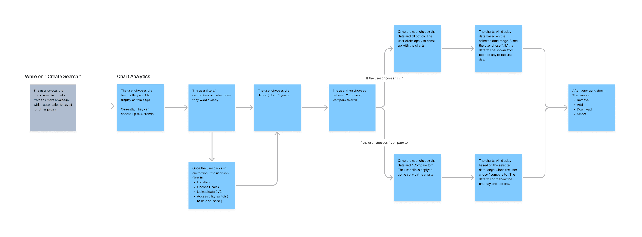
Before jumping into wireframes, we mapped a user flow that laid out the whole journey.
One of the first things we looked at was how many charts to show per page. I wireframed two layouts side by side, one with 3 charts per row and one with 4, and tested both with users. The answer was clear: users preferred 3 charts per page, since it kept each chart big enough to read without crowding the screen.
Next we tested the top section. The data showed that users often link choosing between “till” and “compare to” with picking a date, so we tried that pairing, along with the accessibility button that kept coming up. Users didn't like the radio button for switching between “till” and “compare to” and preferred the second option.


Final design
We already had a design system, but this page required additional components for the charts and date selection.
Here is the final design.


Testing
After showing users the final prototypes, the response was positive:
13 users were happy with the new chart design and said it was easier to read and understand the charts.
12 users were glad we added “till” and “compare to” to the date selection, as it saved them a lot of time.
One piece of feedback was about the limit on how many brands users can pick, which we planned to fix in V2.
Reflection
Working in small steps was really important for us as a team. It showed how much time we could save by bringing everyone, including users, in from the start.
After the first project, we started on V2. My contract with Onclusive ended before we could finish it. V2 was meant to give users more freedom with charts: uploading their own data, choosing how many charts to show, and making the more important charts bigger on screen. That last one was meant to be in V1 but got pushed back because of the engineering time and cost.